


AfterGlow
A mobile app that assists skincare enthusiasts with their skincare journey. Users will receive personalized guidance in discovering what products and ingredients are best suited for their skin preferences.
ROLE
UI/UX Designer
TIMELINE
Jan 2024 - Mar 2024
(10 Weeks)
CREDITS
Ariane Keona Ochoa (me)
Rocel Costo
Cortney Ngo
Karen Phan
DISPLICINES
UX Research
Interfaces
TOOLS
Figma
Google Workspace
Miro
UX Research
My team and I were presented with the challenge to design a mobile app that relates to health and wellbeing. We aimed to develop a product that facilitates a personalized and effortless experience of discovering what skincare products and ingredients work best for them.
Through the rise of beauty influencers on social media, skincare products and trends are gaining popularity even among those unfamiliar with skincare. My team set out to design a product tailored to individuals seeking guidance toward gaining a grounded understanding of skincare and its benefits.
GOALS
Analyze existing solutions
Gain insight into user needs, goals, and challenges
Identify the problem
PRACTICES
Competitive Analysis
User Interviews
Affinity Diagramming
Persona
DISCOVERY & COMPETITIVE ANALYSIS
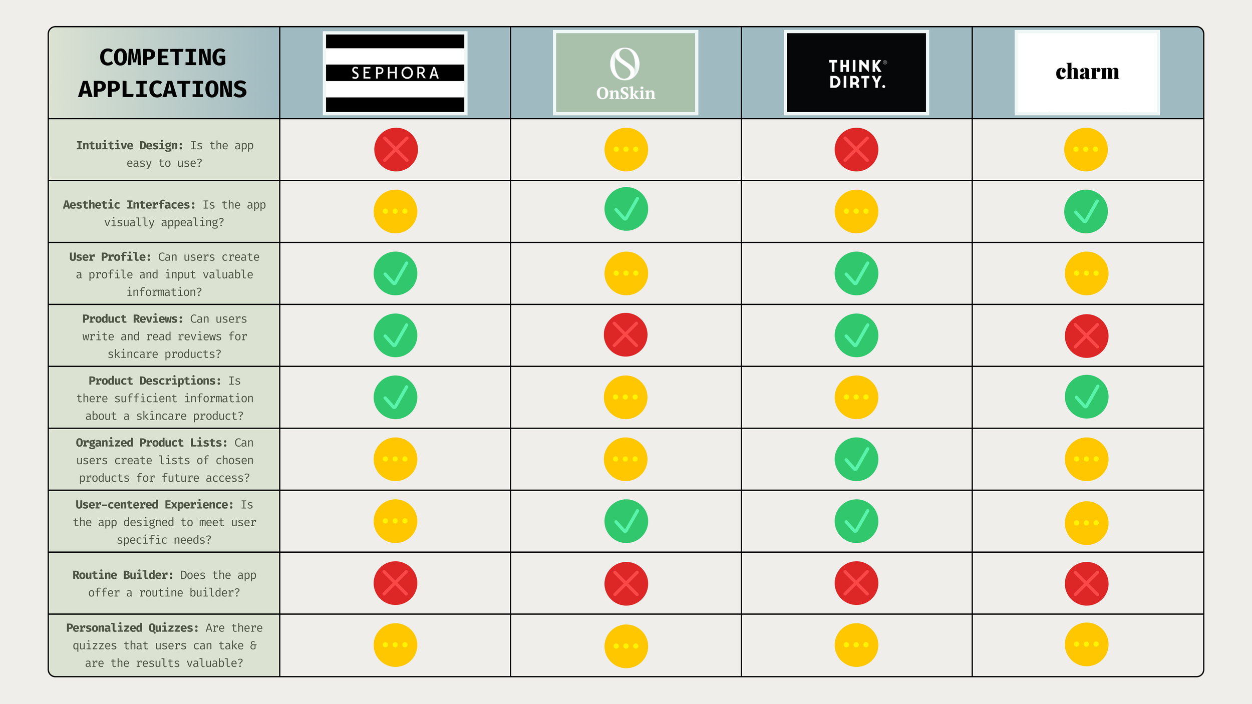
Taking a look at existing skincare apps allowed us to identify what features would be best to adopt and avoid for our solution. We analyzed 4 different competitor: Sephora, OnSkin, Think Dirty, and Charm. We specifically looked out for the interface design and the inclusion of certain features.
We found that the current solutions lacked:
user-friendly design
stability in product information shared
personalized skincare quizzes/questionnaires
assistive routine builders
How we planned to address those shortcomings:
designing an intuitive user interface
incorporating product and ingredient-specific information
tailoring skincare recommendations to user needs and goals
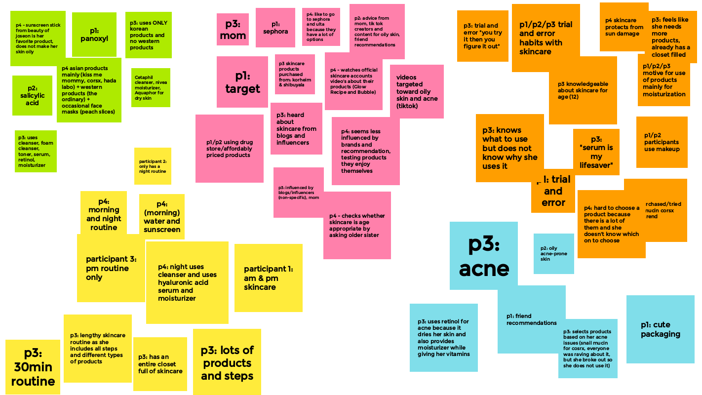
USER INTERVIEWS & AFFINITY DIAGRAMMING
Our initial discoveries helped to inform the 7 user interviews we conducted with adolescent girls to young adults, all interested in skincare. The goal of our interviews was to determine how our target group approaches shopping for and using skincare.
Affinity diagramming allowed us to organize our interview responses into five groups:
yellow represented routines
pink was the source of knowledge/shopping locations
green was remarks related to products
blue organized motivation for product purchases
orange demonstrated final remarks and other information.
A specific insight I gained through my 2 interviews was that friend recommendations played a pivotal role in an individual’s decision to purchase skincare products, even if they did not properly understand why they might need or use them.
KEY INSIGHTS & USER NEEDS
We then had to consolidate our findings into key insights and translate them into actionable user needs that would later inform and guide our storyboarding, persona, and final designs.
KEY INSIGHTS
She wants a way to find skincare products that may work for her but currently does not know where or how to begin her search.
She loves to shop for skincare based on friend recommendations but does not have a firm understanding of why else she should buy the products.
She wants a way to discover the purpose of her skincare products so she can craft an effective skincare routine that addresses her needs.
The worst part about skincare is the trial-and-error aspect because it costs time and money to see if the product is suited for their skin.
USER NEEDS
Learn about skincare products best suited for your skin quickly and easily to make informed skincare purchases. (Storyboard #1 & #4)
Receive personalized skincare product recommendations for your own skin type, goals, and concerns. (Storyboard #2 & #3)
Research skincare ingredients to determine their relevance to your skincare needs in a digestible format. (Storyboard #2 & #3)
View and edit personalized skincare information and preferences that are easily accessible through a consolidated design. (Storyboard #1)
THE PROBLEM
How might we assist individuals interested in skincare to find the proper products and ingredients that suit their needs and concerns?
STORYBOARDS & PERSONA
Every storyboard addresses a scenario described in the user needs listed above and demonstrates how our intended app would solve that problem for the user.
Our persona encapsulates the collective insights we gathered from our previous UX exercises and processes.

Storyboard #1: Discovering what ingredients are suitable for your skin.

Storyboard #2: Researching products that treat your skin needs.

Storyboard #3: Evaluating her skincare conditions through a guided quiz.

Storyboard #4: Learns about specific product and ingredient information in a digestible format.
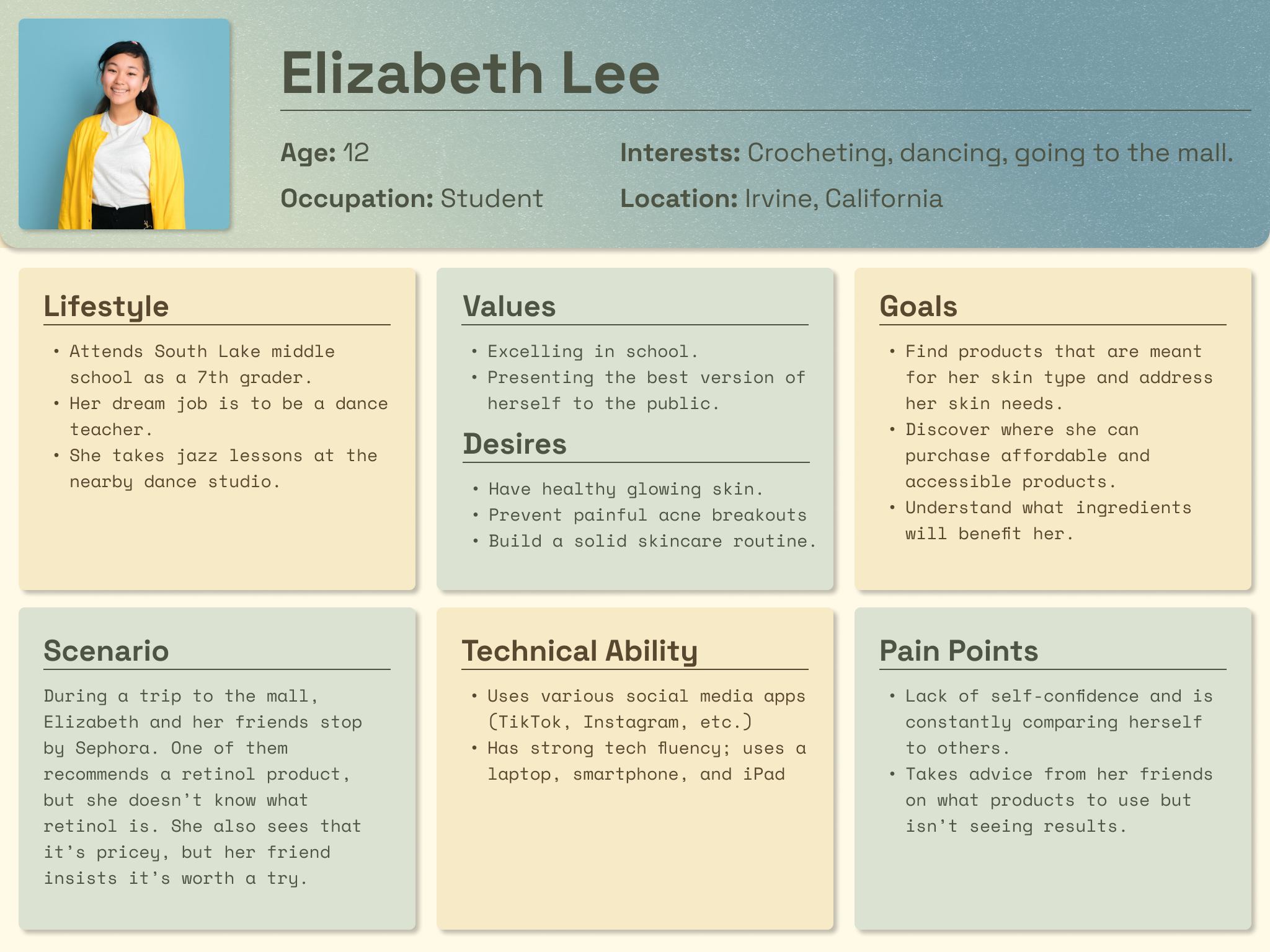
The persona embodies an adolescent girl interested in skincare, who desires to learn more about what products would help her obtain healthy skin and prevent breakouts.
She struggles with self-confidence and is heavily influenced by her peers, so she would benefit from a tool that helps her grasp what skincare products or ingredients would help her skin. Additionally, her demographic information is representative of the identities of a majority of our interview participants.
Interface Design & Development
After completing our UX research, we began the design process. We sketched low-fidelity wireframes, translated them into mid-fidelity on Figma, and refined them to achieve high-fidelity mockups of our mobile app.
Once we had completed building our app, we also tested our prototype with users as the final step in our design cycle.
GOALS
Design all necessary features of our mobile app
Test and iterate on initial prototype
PRACTICES
Wireframing & Prototyping
Design Systems
Usability Testing
LOW-FIDELITY WIREFRAMES
To begin the design process, we sketched low-fidelity wireframes that illustrated our initial feature ideas of AfterGlow. In particular we drew out a home page, skincare quiz, and product and ingredient pages.
We initially had ideas of including a routine builder in our application, so most of the home page sketches focused on that aspect. However, as you will see in the mid-fi wireframes, we decided against that, as our user needs reflect a necessity for assistance and guidance rather than autonomy and tracking.

Home Sketches: skincare status, routine builder, and skincare shelf

Skincare Type/Needs Sketches: quiz pages and layouts for results

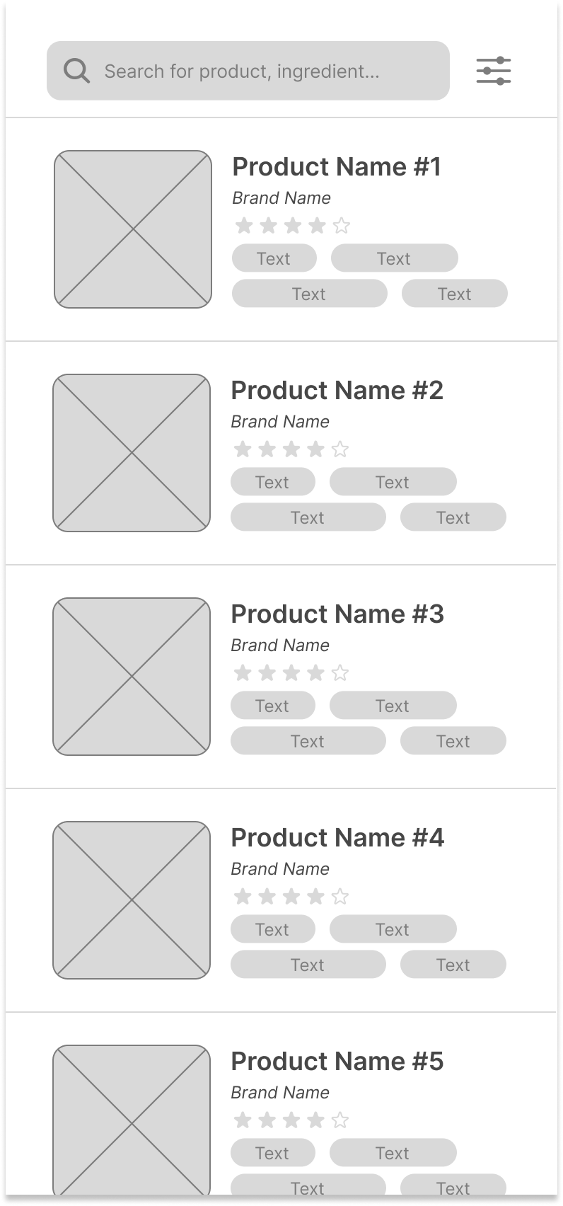
Product & Ingredient Sketches: photos of the item and related descriptions
MID-FIDELITY WIREFRAMES → HIGH-FIDELITY MOCKUPS
After reviewing the lo-fi sketches, we decided on our final features for the app:
searching for products and ingredients
a customizable and personalized experience through a skincare quiz and tailored recommendations
We then transferred our collective ideas into Figma through mid-fidelity wireframes and, furthermore, high-fidelity mockups.
01 / Onboard Pages
Upon creating an account on the app, users are led to the skincare quiz, in which information about the user’s skin and general preferences is collected. The responses on this quiz will inform and populate the user’s profile page and the user’s entire experience on the app, as their selected preferences will automatically tag specific products and ingredients if those preferences apply.
With the skincare quiz completed, the home page is now populated with the user’s preferences and fulfills user need #1 to easily access personalized information about curated skincare products and ingredients.
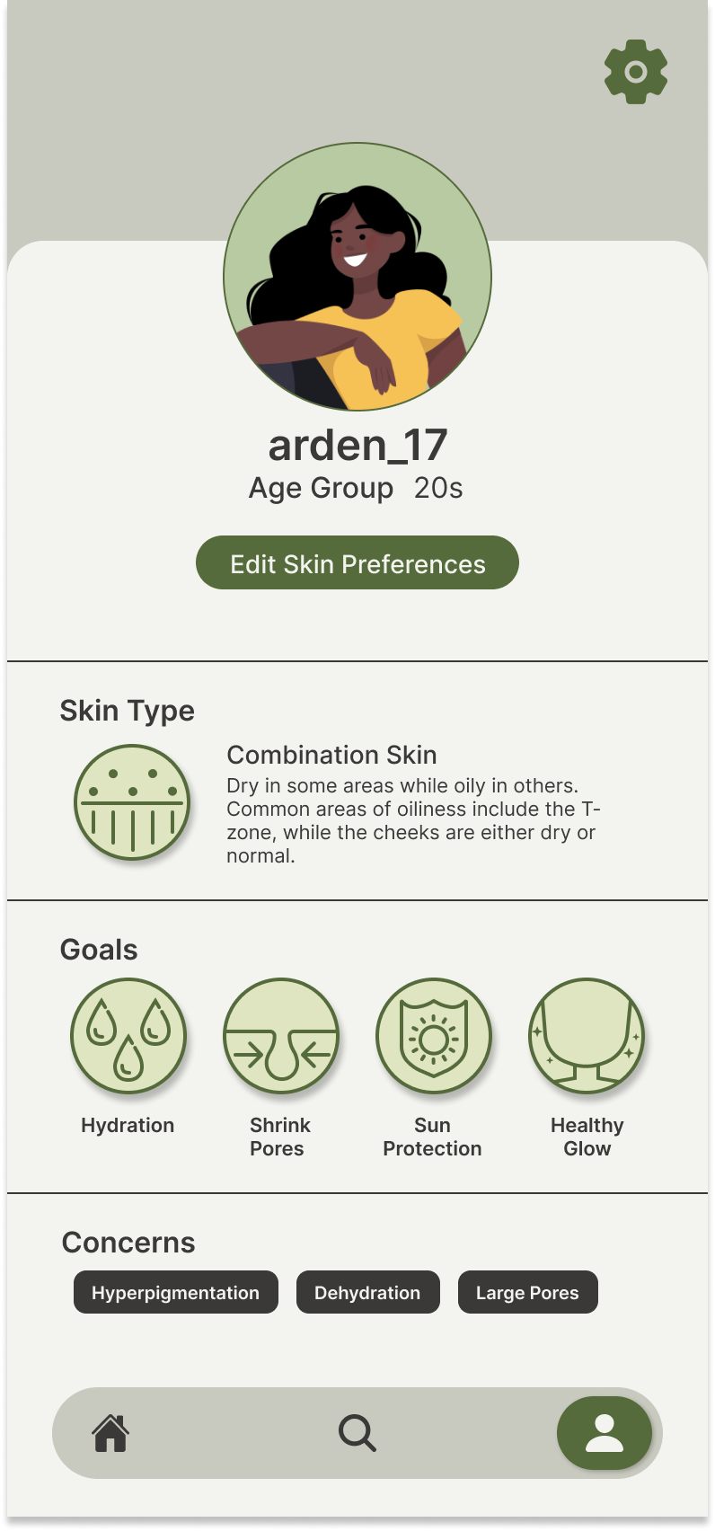
02 / Profile Page
From the profile page, users can edit the skin preferences displayed at any time. Additionally, clicking on the skin type, goals, or concerns directs users to a separate page containing detailed information on the type, need, or concern.
The profile page addresses user need #4, to view and edit their skincare preferences and plays a pivotal role in providing users with a personal experience on the app.

→
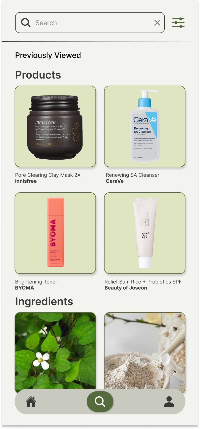
03 / Search Page
The search page acts as a hub for users to locate specific products and ingredients based on tags and filters.
We developed the search page further in the hi-fi mockup to include the user’s previously viewed products and ingredients to simplify their search process. Once users search for something, the page will populate with a list of products or ingredients for the user to find out more about.

→
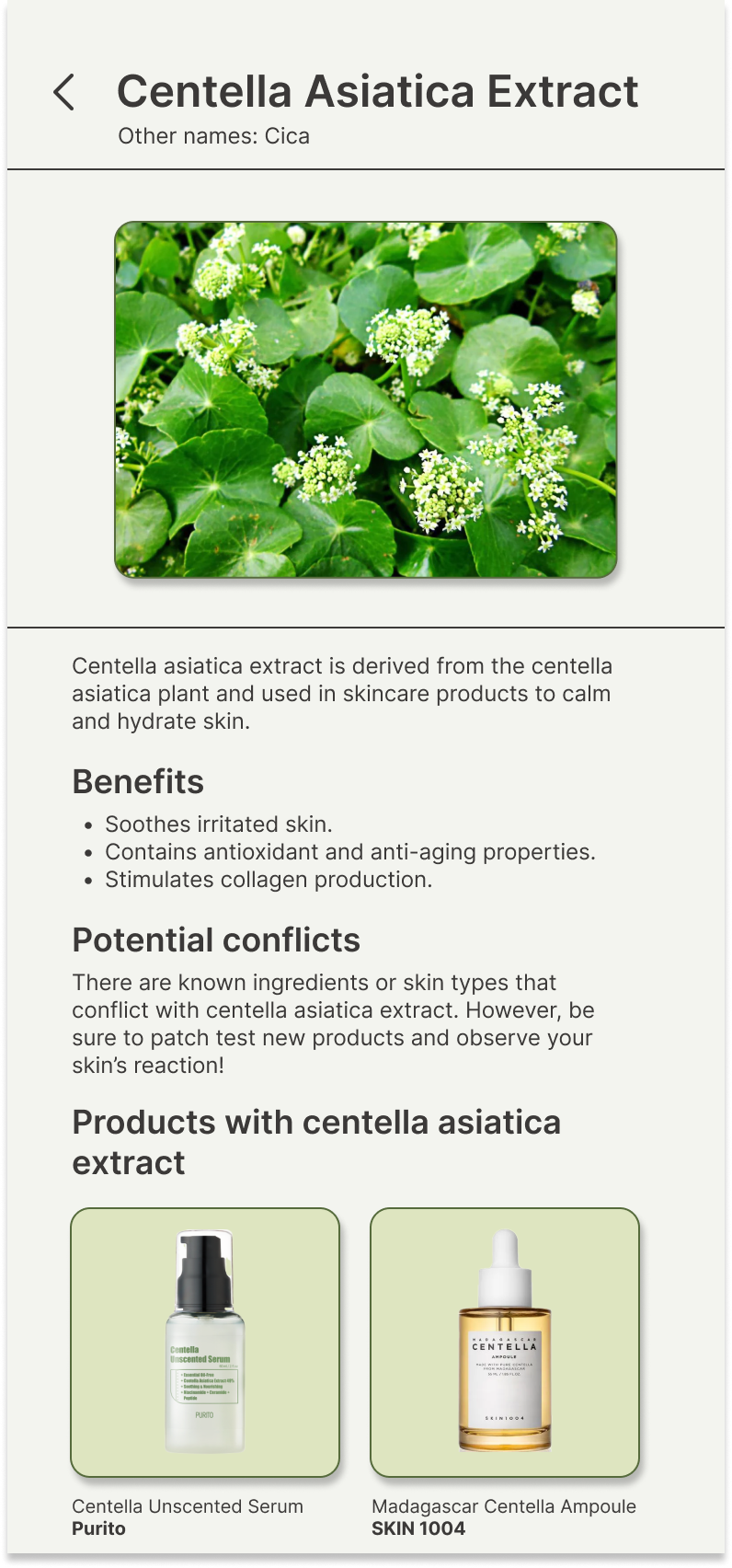
04 / Product & Ingredient Pages
The product and ingredient pages are where users can learn more about the benefits and potential conflicts of using certain skincare products. These pages hold detailed information about the product or ingredient, which addresses user need #3, to research specific items to make informed purchases in the future.
Designing these pages was pivotal to solving our problem, as our purpose was to assist skincare enthusiasts in discovering what products and ingredients to use for their skin needs, goals, and concerns.

→


USABILITY TESTING
As part of the finalization of our prototype, we conducted some usability testing to gain insight on how to improve users’ experience on the app and ensure that it is easy to use.
My participant was tasked with creating an account and viewing her selected skin preferences. This task addresses user need #4 and it is intended to take the user through one of the main functionalities of the app: personalizing their profile through a prompted quiz and viewing and accessing that information in an intuitive way.
Through the evaluation I completed, the user indicated that her main concerns were:
Unlickable options appear clickable.
The lack of diversity in skin tones for the images of skin type, goals, and concerns.
To address these issues, I adjusted the prototype so that:
Only the clickable options would appear clickable when hovered over within the skincare quiz pages.
In the specific skin type, goal, and concern pages, I added images that include various skin colors to make the experience more inclusive for users.
Reflection
This project was completed for a human-computer interaction class, allowing us to delve into the design process and go through every step from empathizing and ideation to prototyping and testing. Conducting thorough user research was a pivotal part of this project, and it pushed us to consistently refer back to our findings while designing to inform our decisions. It also allowed us to carefully take time to re-evaluate our problem statement after each step and implement any necessary changes.
Given more time, we would have conducted additional usability testing. We only began to test our application at the very end of our timeline, so there was little time to make iterations. We ended up only making minimal improvements and technical adjustments to our mockups. However, the entire prototype would have benefited from our team completing extensive usability testing to ensure that we uncovered user frustrations and needs and had enough time to implement that into a final prototype.