Women’s Gathering 2025
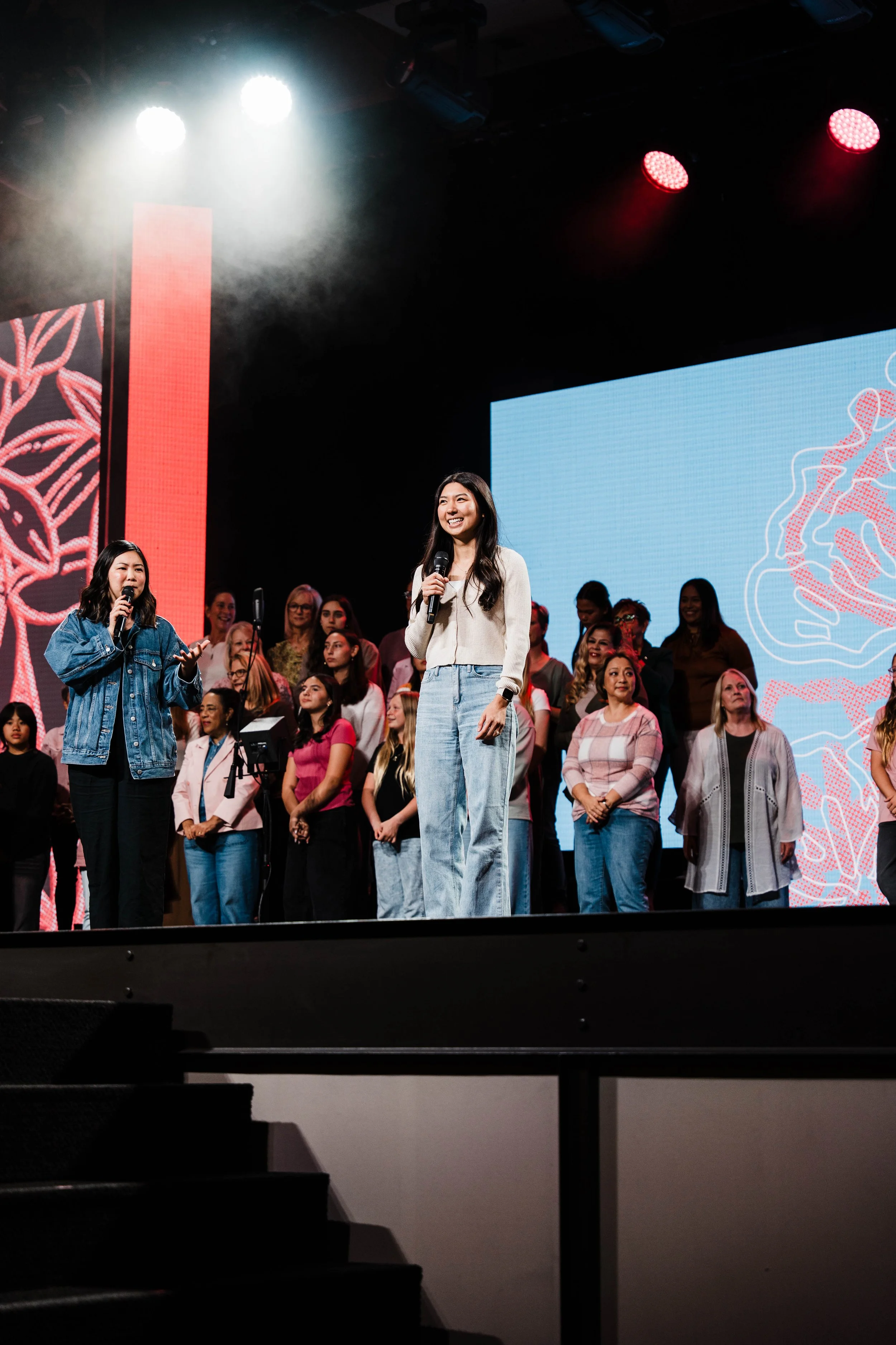
As Saddleback Church prepared to host their first Women’s Gathering in a couple of years, I was tasked with building the brand for the Women’s Ministry and producing a set of assets for this event that reached 3,200+ women across Orange County.
ROLE
Graphic Designer
TIMELINE
Aug 2025 - Oct 2025
(6 Weeks)
IDEATION
Moodboarding, Exploration, & Conceptualizing
The main goals I had in mind when developing the Women’s Gathering brand was to provide Saddleback Church with a visual identity that the community had not yet seen and one that connected with the target audience of women aged 25 to 45 years old.
I ensured that the moodboarding and planning I did would employ aesthetics that felt inclusive and versatile to women of all ages and used a combination of youthful and mature elements to reach women in various life stages.
-

Moodboard #1 - Charm
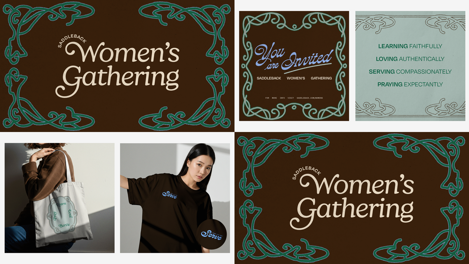
I was instantly drawn to the concept of combining brown with cool toned greens and blues to create a chic and whimsical aesthetic. With dramatic typography and art nouveau borders this moodboard presents an elegant and inviting tone to the brand.
-

Moodboard #2 - Ballet
I lunged at the opportunity to bring in some femininity to Saddleback’s branding and was inspired by the recent coquette and ballet aesthetics that have circulated the fashion space over the years. This moodboard unites soft pinks with stitching elements for a classy yet playful visual identity.
-

Look #1 - Whimsy Art Nouveau
Inspired by the whimsical type and grandiose borders in moodboard #1, this look strives to combine elegance with eccentricity - an aesthetic that Saddleback has yet to explore.
-

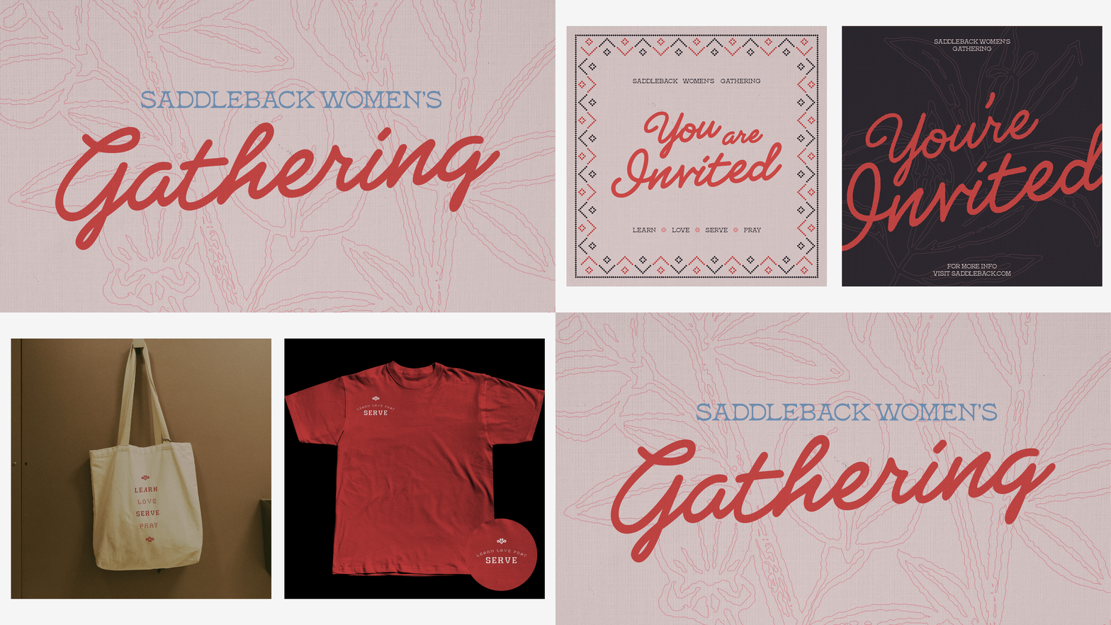
Look #2 - Vintage Coquette
Combining classic stitching patterns with a limited berry-esque color palette creates an inviting and cozy look that uses its nostalgic charm to its advantage, keeping the vibes friendly yet fresh.
APPLICATION
Developing the Identity & Brand Application
Based on feedback from clients, there was a general preference towards look #2 due to its brighter colors and floral elements, but an appreciation for merchandise stylizing from look #1. With the target audience of women aged 25-45 years old, the stitching details in look #2 felt misplaced and the baroque borders too polished.
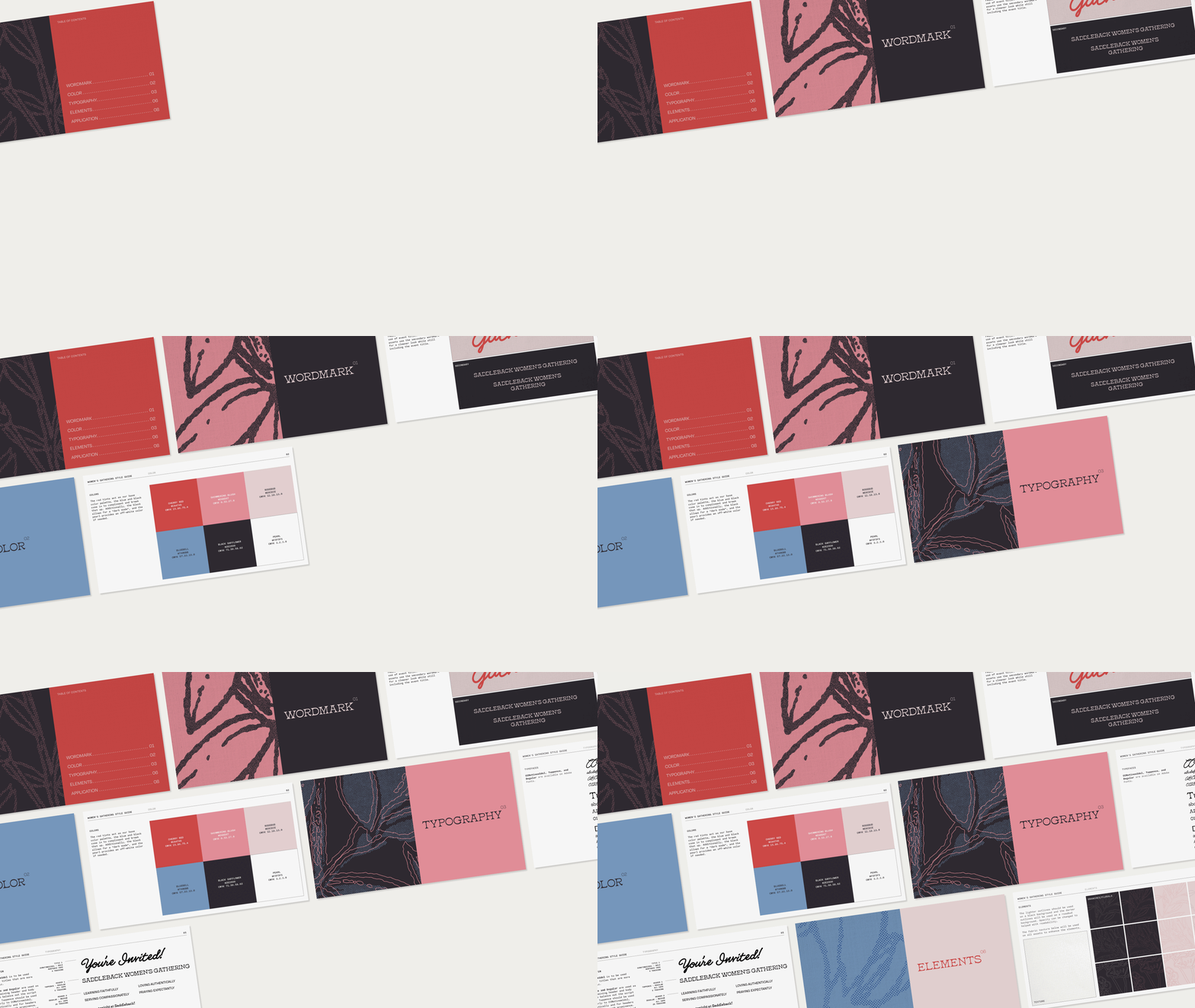
My solution? Find ways to combine the positives from each of the looks: incorporate the simpler borders from look #1 to replace the stitch elements in look #2 and adapt look #1’s merch to the color palette and styling of look #2.


